Understanding & Leveraging Google Analytics for Small Businesses
Google Analytics is a free tool we recommend to all our clients. It collects valuable information about how visitors experience your site, and you can leverage that information to improve your business' digital presence.
At the beginning of this year, we started a Google Analytics series to empower businesses owners, unlocking what that big wall of data is actually telling you and how to use that information strategically.
Now, we're putting it all together in one simple guide. At its core, Google Analytics helps you identify patterns - good, bad, and indifferent. Here's how you should be looking at them.
Page View Metrics
Often viewed as one of the simplest places to start, your page view metrics show which pages people return to, where they linger, and where momentum drops.
Let's look at an example:
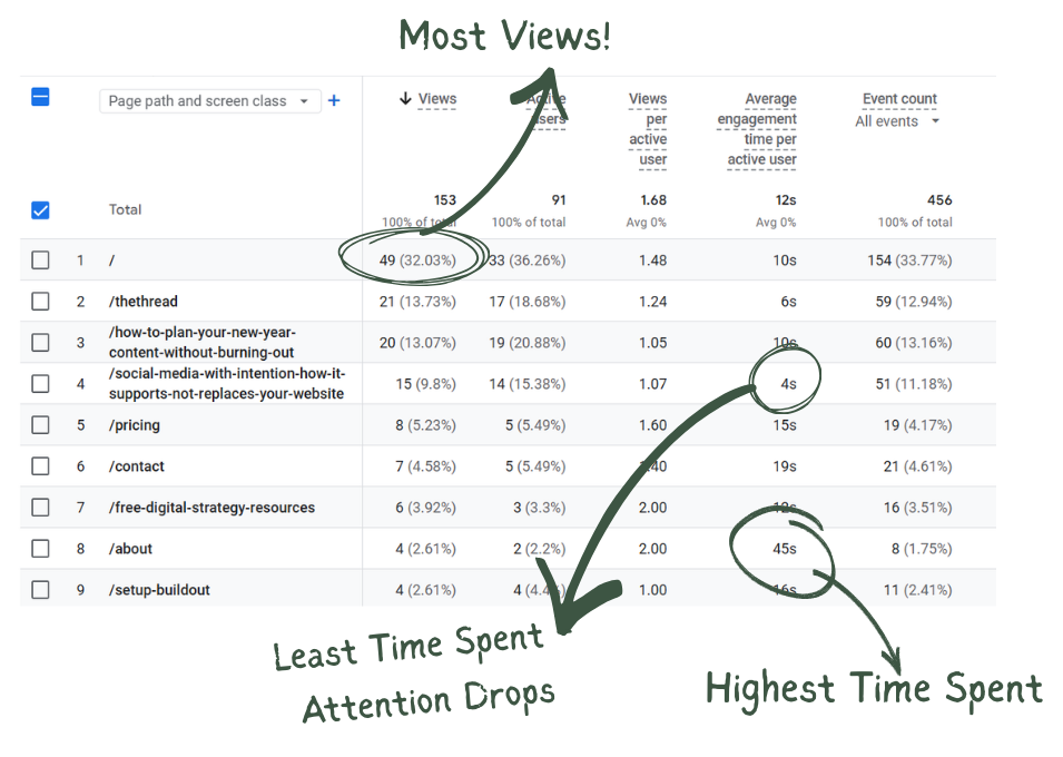
Here we can see #1, the homepage, has the most views. This makes sense and is very common. Unless you are investing a lot (of time and/or money) into advertising your landing or sub pages, visitors almost always start at your homepage.
On the other hand, pages with very low views might signal a need to better advertise that page, if it is useful, and perhaps remove it if it is not.
Whatever page is getting the most views (likely your home page), should also be doing most of the heavy lifting. It should answer most questions a first time visitor might have like, "what services do you offer" and provide guidance to next steps with a call to action like "schedule a consultation" or "make a purchase".
Through page view metrics, we can also analyze time spent on a page. A high average indicates that particular page is engaging. People are lingering to absorb the information you provide. A low average might indicate that page needs more work - whether that be engaging visuals, better attention hooks, or more valuable information.
With page metrics you can also look at:
- Active Users - The number of users who stayed on a page for at least 10 seconds, viewed two or more pages, or triggered a conversion event such as completing a contact form.
- Views per Active User - The average number of page views generated by each unique active user, calculated by dividing total views by total active users. A higher ratio suggests users are navigating deeper into the site or returning to view more content, while a lower ratio may indicate users are leaving after viewing only one page.
- Event Counts - The total number of times an event occurs. Events are interactions with your site such as page views, session starts, scrolls, clicks, and custom events. The higher your event count, the more your viewers are engaging with your site.
DAU / WAU / MAU Metrics
Next in the series, we looked at the Daily, Weekly, and Monthly Active Users, referred to as DAU, WAU, and MAU.
Daily Active Users
Measures the people who return to your site in a single day.
It's strongest for news, communities, tools, or daily-use platforms.
Most small service-based businesses do not expect daily site interactions. DAU is likely to be your lowest number, and that is totally normal.
Weekly Active Users
Measures the people who return to your site within one week.
This often tells the most useful story for blogs, e-commerce businesses, and sites that publish regular, but not daily content.
It allows you to see whether people are returning consistently, even if they don't visit every single day.
Monthly Active Users
Measures the number of users who return within a month.
This metrics is highly reflective of brand recall, long-term relevance, and whether your site remains useful over time.
For many small businesses, MAU is the most meaningful metric to track.
Together, these metrics are used to measure user stickiness, the percentage of users who return on a daily, weekly, or monthly basis.
The user stickiness ratios measure active users over shorter timeframes against longer ones. They are calculated by dividing DAU by MAU, DAU by WAU, and WAU by MAU.
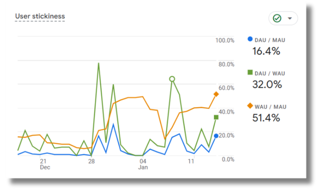
"Good" ratios vary highly by industry. A daily use site such as a social media platform might aim for a DAU/MAU ratio of over 50%, whereas B2B businesses might aim for 10-20%.
The context matters. Are you expecting people to use your site every day? A business that publishes a monthly newsletter might expect users to return on a monthly basis, while a provider of annual services without regular content updates may only expect to see visitors return once a year.
Cohort Analysis
This is one I'll admit didn't click for me at first, but once you stop reading them like traffic stats and start looking at behavior over time, it all comes together.
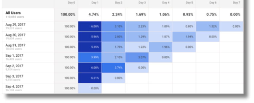
In Google Analytics, Cohorts group users who first interacted with your site around the same time and measure their retention over time.
The darker the blue, the more people in that group returned to your site.
Traffic metrics alone don't provide the depth of information a cohort measurement can.
Cohort metrics allow you to ask (and answer)
- Did people come back after a specific blog post?
- Did a launch, update, or announcement improve return visits?
- Did something new create friction that stopped people from coming back?
Obviously Google Analytics don't answer these questions directly, but you can absolutely draw these conclusions by analyzing the chart.
Step 1: Review One Cohort at a Time
Does it fade quickly, slowly, stead steady, or is it a bit more unpredictable?
Step 2: Compare Cohorts and Look for Patterns
Do newer cohorts behave differently than older cohorts? Where are you seeing the greatest return and what were you doing differently on your site at that time? Did you publish a new tool, a new blog, or completely revamp your homepage?
Analyzing these differences can show you what efforts are working well and what might need improvement.
Common Patterns & What they Generally Indicate
- Fades Fast - The experience is not pulling them back.
- Stays Dark Longer - You are providing trust-building content, clear navigation, and visitors show repeat interest.
- One Row Unusually Dark - Something specific drove return visits (post, promo, referral, event). Look back to identify it and leverage that strategy in the future.
- One Row Unusually Light - Something specific hindered return visits. This could also be a post, promo, referral, or event. Ask yourself:
- Did expectations match the experience?
- Was the next step clear?
- Did the content stay relevant?
- Did anything seem confusing or incomplete?
While Cohorts cannot directly tell you why someone left during a visit or what turned them away on a specific page, you can use these clues to identify what is bringing people back and spot where momentum is missing. You just have to put on your detective hat.
Bounce Rate
Bounce rate is another core metric, but too often it is checked, judged, and dismissed without taking the time to investigate and understand what it is telling you.
When reviewed across pages, it can reveal whether content is meeting expectations and supporting engagement, or not.
Bounce rate measures the percentage of sessions where a visitor lands on a page and leaves without taking another action. It is closely tied to engaged sessions - sessions where visitors spend at least 10 seconds on the page, navigate to two or more pages, or take a conversion action like click-to-call.
As engages sessions increase, bounce rate decreases.
A High Bounce Rate
Typically signals low trust or misaligned expectations. Common explanations we frequently see include:
- Pop-ups that interrupt the experience
- Slow load times (often caused by heavy visuals)
- A page doesn't match what your Google search result promised (if your meta data says your page answers questions about a service, but the page is actually for a different service, you have broken trust.)
- No clear next steps for visitors
A Low Bounce Rate
Reveals that page is doing something right. Look for what it has that other pages with higher bounce rates do not have. This might be:
- Clean structure that is easy to scan
- Strong headlined that matches intent
- Helpful visuals that support the message
- Clear next steps (buttons, links, etc.)
The key is to use your best performing pages as templates or guides. Identify what is working and then apply it to your weaker pages.
The goal is to increase engaged sessions by making pages feel trustworthy, clear, and easy to navigate.
In Summary & Our Philosophy
This recap isn't meant to cover every single metric Google Analytics offers. The platform is deep, and it can go far beyond what most small businesses need day to day. Instead, these metrics - page views, DAU/WAU/MAU, cohorts, and bounce rate - offer a strong starting point. In my experience, they provide some of the most meaningful insights into how a website is actually being used by visitors and how it supports the business over time.
There is no pass or fail when it comes to analytics. The goal is not perfect or constant upward movement. You want to see general grown and improvement, yes, but fluctuations are normal. Busy seasons, slower months, launches, life, and market shifts all show up in the data. Analytics are most valuable when viewed as a long-term story, not a single snapshot.
If you'd like to keep learning, we share ongoing insights across platforms and send a monthly newsletter with updates, education, and behind-the-scenes content (no spam, promise!). You are welcome to follow along wherever you prefer or subscribe to stay in the loop.
And if you ever have questions about your own analytics, please don't hesitate to reach out. We always recommend reviewing data with a strategist who can help translate numbers into meaningful next steps. If your analytics aren't set up yet, or you're not sure what you're seeing, we are always happy to help make sure you are taking advantage of the free tools available to you so you're not missing out on information that could genuinely support your growth.
Stay in the Loop!
Follow along on your preferred social platform,
Email questions for future updates,
& Subscribe to our monthly newsletter.